DataSync Center
Read the pulse of your pipelines before incidents escalate.
Malaysia-based training for teams building observability around streaming data, freshness, and visual analytics.
Social proof
Operators who already ship with clearer signal maps

Why DataSync Center
Observability that stays readable under load
We focus on the messy middle between raw telemetry and executive dashboards: naming conventions, lag indicators, and visual layouts that survive a noisy Monday morning.
Each program mixes short theory blocks with live lab work so analysts and platform engineers share the same language when a pipeline stalls.
Meet the practiceFeatured programs
Courses shaped around production habits
Start with the flagship studio, then deepen with shorter intensives for metrics design and incident review.
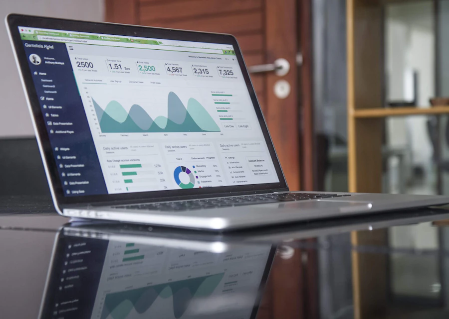
Signal Flow Studio
Flagship program for designing a Data Visualization and Analytics Platform for Real-Time Data Pipeline Observability.

Freshness Metrics Lab
A focused workshop on lag budgets, watermarking, and visual cues that expose stale streams.
Incident Narrative Clinics
Practice writing post-incident visuals that help product and ops agree on what actually failed.
From learners
“After the lag-budget module in Signal Flow Studio, our on-call channel stopped arguing about whether Kafka was ‘slow’ and started tracking watermark delay instead.”
Nadia R., streaming lead — Kuala Lumpur
“The dashboard redesign exercise was useful, though I still wish we had spent one more hour on alert thresholds. Even so, our freshness panel is finally readable at a glance.”
Client in retail analytics
Bring your pipeline map to a working session
Tell us where signals get muddy. We will suggest a course path or a team clinic.